
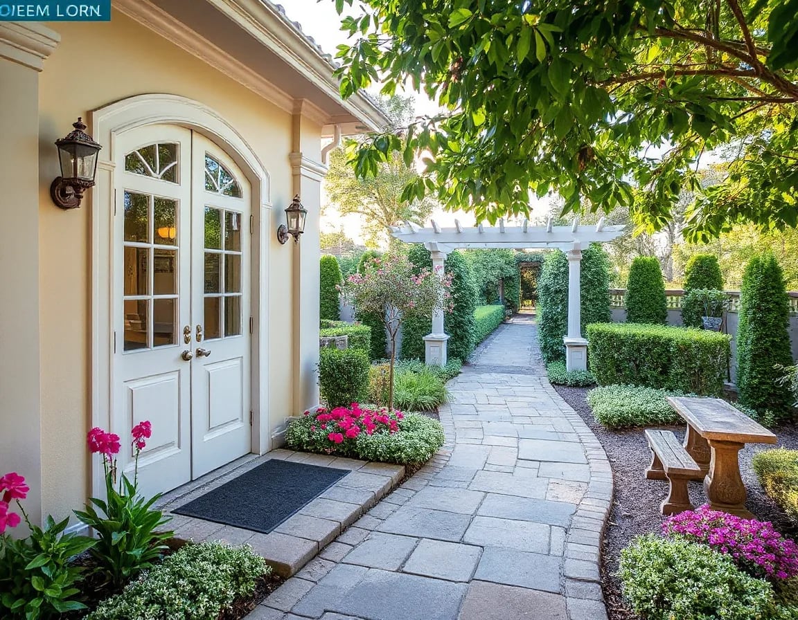
If you want your home to feel brighter, cleaner, and more move-in ready before it hits the market, paint is one of the smartest places to start. The best paint colors to sell your house in 2026 are likely to be soft, flexible neutrals that photograph beautifully, calm down busy spaces, and help Bay Area buyers imagine themselves living there. Thoughtful color choices will not guarantee a higher sale price, but they can absolutely improve first impressions and support a more polished presentation.
When Bay Area homeowners ask which updates are worth doing before listing, paint is almost always near the top of the list. It is relatively cost-effective, it transforms how light moves through a room, and it can make a home feel cleaner, newer, and easier for buyers to understand. In a market where presentation matters, the right palette helps reduce visual friction and creates the kind of move-in-ready appeal that buyers respond to quickly.
That is why conversations around the best paint colors to sell your house 2026 are so relevant right now. While no one can claim perfect certainty around next year’s trends, resale-minded sellers can make smart choices by leaning into timeless, design-forward Benjamin Moore paint colors for resale. The goal is not to make your home look trendy for trend’s sake. The goal is to make it feel elevated, broadly appealing, and easy for buyers to picture as their own.
For sellers, that distinction matters. A home that feels fresh and cohesive tends to create less resistance during showings, stronger listing photos, and a more confident first impression online. Buyers are often making emotional judgments within seconds, especially when they are scrolling through listings on their phones before deciding which homes are worth seeing in person. Paint cannot solve every presentation issue, but it can remove distractions, soften dated finishes, and help the home itself take center stage.
In the Bay Area, where architecture, natural light, and buyer expectations vary dramatically from one neighborhood to the next, paint choices need to be thoughtful rather than generic. A color that looks beautiful in a bright Peninsula home may read completely differently in a fog-filtered San Francisco interior. A shade that flatters modern finishes in a newer condo may not be the best fit for a traditional home with warmer wood tones. That is why the most effective pre-listing paint strategy is usually one that balances broad appeal with the specific character of the home.
Below are five Benjamin Moore color directions that are especially well suited for sellers heading into 2026. These are not promises of value increases. They are practical, resale-friendly choices that can support a stronger overall presentation.
Why Paint Color Matters When You’re Preparing to Sell
Paint does more than change a wall color. It affects perceived brightness, room-to-room flow, and even how large or calm a space feels in listing photos and in person. In the Bay Area, where homes range from classic San Francisco architecture to sleek Peninsula interiors, color can either highlight a home’s character or compete with it.
Buyers tend to respond best to interiors that feel fresh but not sterile, stylish but not overly personal. That is why the best interior paint colors for home sale usually sit in the neutral family, with enough warmth to feel welcoming and enough sophistication to feel current. If you are choosing paint colors that help homes sell, think less about your favorite statement shade and more about what helps the home itself shine.
It also helps to remember that buyers rarely evaluate paint in isolation. They are taking in flooring, cabinetry, countertops, trim, ceiling height, window placement, and furniture all at once. If the wall color fights with those elements, the whole room can feel less resolved. If the wall color supports them, the space often feels more expensive and more intentional, even when the update itself was relatively simple.
For sellers who are deciding where to spend time and money before listing, paint often delivers because it improves both the in-person experience and the digital one. Rooms with cohesive, light-reflective color tend to photograph better, and that matters in a market where online presentation drives showing activity. A buyer may never consciously say, this paint color is why I booked the tour, but they often respond to the overall feeling it creates.
1. Soft Warm White: Benjamin Moore White Dove
For many sellers, a soft warm white is still the safest and most effective starting point. Benjamin Moore White Dove remains popular because it feels clean without looking harsh. It has enough softness to work in Bay Area light, especially in homes that get fog-filtered daylight or cooler morning exposure.
White Dove works especially well in living rooms, hallways, entryways, and open-concept main spaces where you want continuity. It can also be a smart choice for trim and walls in homes where architectural details deserve attention. Buyers often respond well to this kind of backdrop because it feels bright, cared for, and easy to furnish around.
In resale terms, this shade supports a polished first impression. It helps rooms photograph well, tones down visual clutter, and gives staged furnishings a more upscale look. If your current walls are yellowed, overly beige, or inconsistent from room to room, this kind of warm white can create an immediate sense of reset.
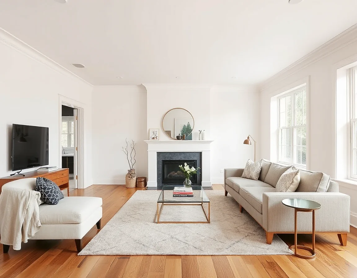
The image above reflects exactly why soft warm whites remain one of the strongest Benjamin Moore paint colors for resale: they make a room feel open, calm, and expensive without overwhelming the eye. In online listing photos, that subtle brightness can help buyers focus on the space rather than the paint itself.
White Dove can be especially useful when a seller wants to simplify a home that currently feels visually busy. If several rooms have different paint histories, a unifying warm white can make the entire property feel more coherent. That kind of consistency matters because buyers often interpret a cohesive palette as a sign that the home has been maintained thoughtfully over time.
That said, even a dependable white should be tested before you commit. In very bright rooms, White Dove may read lighter and cleaner. In dimmer spaces, it may show more warmth. Sellers who sample it on multiple walls and look at it at different times of day usually make better decisions than those who rely on a tiny paint chip under store lighting.
2. Greige That Feels Current: Benjamin Moore Pale Oak
If you want a little more depth than white, Pale Oak is a strong contender. This is the kind of greige that feels gentle, sophisticated, and highly adaptable. It bridges warm and cool tones well, which is useful when a home has mixed finishes such as oak floors, stone counters, brushed metal hardware, or both warm and cool textiles.
Pale Oak tends to work beautifully in bedrooms, dining rooms, and transitional spaces where a pure white might feel too stark. It is also a smart option in homes with softer natural light, because it adds warmth without becoming muddy. For sellers, that balance matters. Buyers often read this kind of color as intentional and designer-informed, not builder-basic.
If your home has several fixed finishes you are not replacing before listing, a flexible greige can be the bridge that makes everything feel more cohesive.
Among the best interior paint colors for home sale, greige continues to perform because it helps buyers imagine a range of styles. Minimalist buyers can see a clean canvas. Traditional buyers can see warmth. Contemporary buyers can see restraint. That broad compatibility is exactly what sellers want.
Pale Oak is also helpful when a seller wants softness without drifting into a color that feels too beige or too cool. Many homes have permanent elements that are difficult to coordinate, especially if updates happened in phases over the years. A balanced greige can reduce that tension and make the home feel more unified without requiring a full renovation.
As you move from a white-based palette into greige, transitions become even more important. The goal is not to create obvious color changes from room to room unless there is a reason to do so. Instead, think about how one space leads into the next. Buyers tend to experience a home as a sequence, and a palette that flows naturally can make the entire property feel calmer and more refined.
3. Light Taupe Neutral: Benjamin Moore Edgecomb Gray
Edgecomb Gray is another resale-friendly favorite, especially for sellers who want warmth without heaviness. Despite the name, it reads more like a light taupe-beige neutral in many homes. It can soften sharper architecture and make older interiors feel more updated without erasing their character.
This shade works well in family rooms, secondary bedrooms, and homes with medium-toned wood flooring. It is especially useful when you want a little contrast from bright white trim but still want the overall effect to feel light. In Bay Area homes with a mix of sun and shadow throughout the day, Edgecomb Gray often stays balanced and approachable.
Buyer response to this kind of color is usually positive because it feels easy to live with. It does not ask too much of the buyer. It supports furniture placement, complements staging, and helps rooms feel settled. When sellers ask about paint colors that help homes sell, this is the kind of shade that earns attention because it is quietly effective.
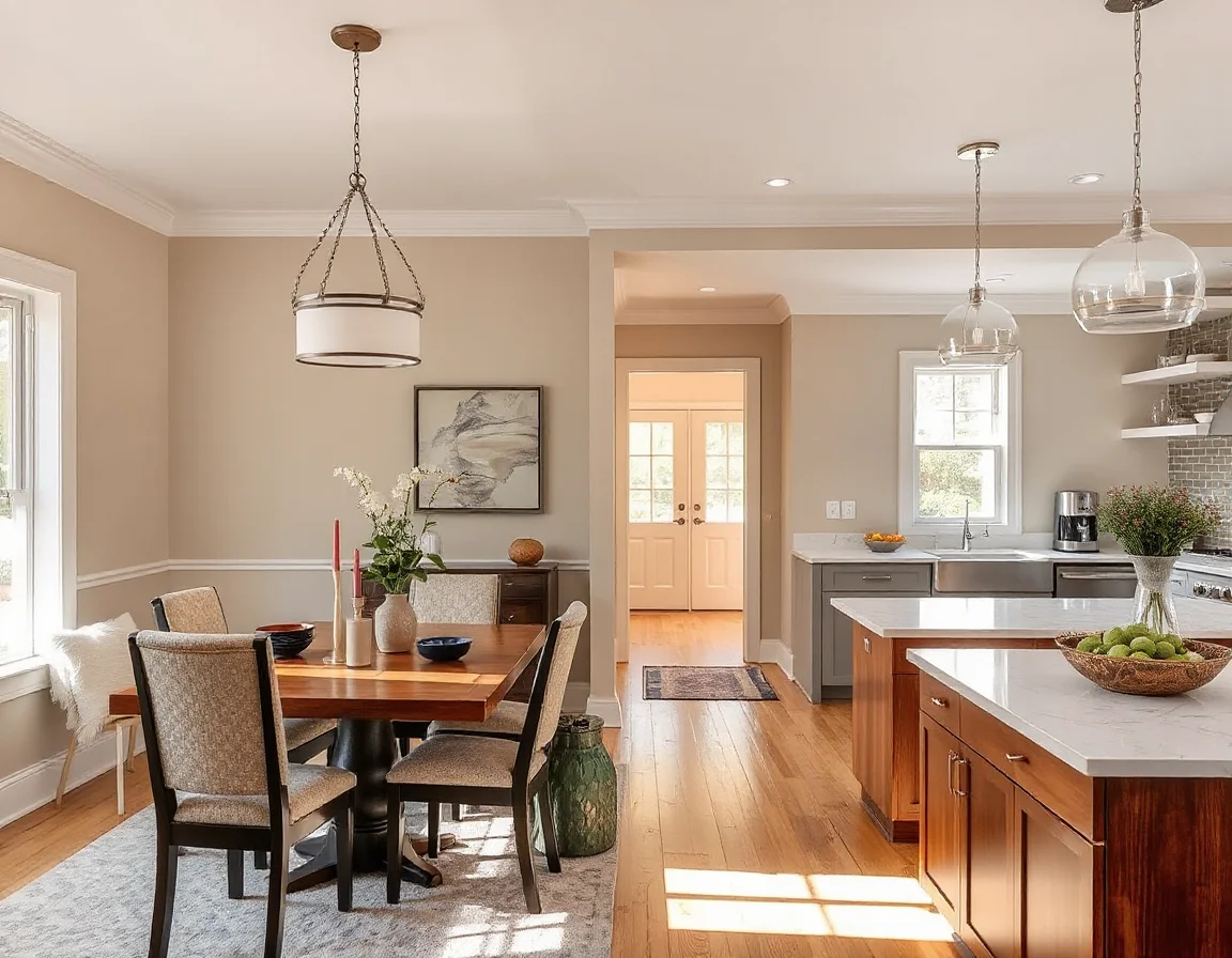
Notice how a greige-taupe palette can make adjoining spaces feel connected and calm. For resale, that visual continuity matters. Buyers touring a home tend to feel more confident when the finishes look coordinated rather than pieced together over time.
Edgecomb Gray can be particularly effective in homes where sellers want to preserve warmth. Some owners worry that moving toward resale-friendly neutrals means stripping all personality from the home. In reality, a light taupe neutral often does the opposite. It keeps the atmosphere inviting while still making the space easier for buyers to project onto.
This is also a good reminder that the best paint strategy is not always the lightest possible one. In some rooms, especially those with warm flooring or softer light, a touch more depth can feel more natural than a stark white. The right neutral should support the room, not overpower it or make it feel washed out.
4. Muted Blue-Green Accent: Benjamin Moore Quiet Moments
Not every room needs to be neutral from corner to corner. In fact, one of the more design-forward approaches for 2026 sellers may be using a restrained blue-green in the right place. Benjamin Moore Quiet Moments is a good example. It is soft, muted, and spa-like rather than bold or trendy.
This color works best as a selective accent in bathrooms, bedrooms, or even a home office nook. It can also be effective on cabinetry or a single feature wall when the rest of the palette stays calm. The key is moderation. Sellers are not trying to create a dramatic personal statement. They are trying to add a touch of character that still feels broadly appealing.
Buyers often respond well to muted blue-green because it suggests calm, retreat, and thoughtful design. In the right room, it can make a home feel more memorable without becoming risky. That is an important distinction. The best Benjamin Moore paint colors for resale are not always the most invisible; sometimes they are the ones that add just enough personality in a controlled way.
A soft accent color can work in a listing when it feels intentional, limited, and easy to coordinate with the rest of the home.
For sellers, the safest way to use a color like Quiet Moments is to think in terms of support rather than statement. A powder room, guest bath, or quiet bedroom can benefit from a subtle shift away from all-neutral walls, especially if the home otherwise feels very plain. But the accent should still relate to the larger palette so the home feels curated rather than experimental.
This is where restraint becomes valuable. Before listing, buyers generally respond better to one or two carefully chosen moments of color than to a house full of competing ideas. If a shade feels too specific to your personal taste, it may be better saved for your next home rather than used as part of your resale strategy.
5. Crisp Elevated Trim and Cabinet White: Benjamin Moore Chantilly Lace
For sellers updating trim, doors, or cabinetry, Chantilly Lace can be a strong supporting player. It is a cleaner, crisper white than White Dove, so it is often best used where you want definition and freshness rather than all-over softness. In the right home, it can sharpen the entire presentation.
This shade works especially well on trim paired with warmer wall colors, or on kitchen and bath cabinetry where you want a bright, tailored finish. In homes with good natural light and contemporary styling, it can feel especially polished. Buyers often interpret crisp white millwork and cabinetry as a sign that a home has been refreshed with care.
Used thoughtfully, this color can help create the kind of contrast that makes photos pop while still keeping the overall palette neutral. That is valuable when preparing a listing for both online marketing and in-person showings.
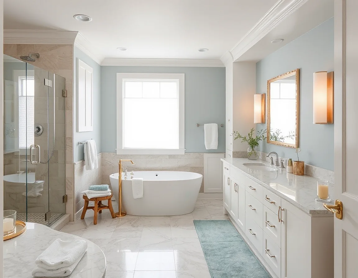
The image here shows how crisp whites and restrained color accents can work together. The result feels fresh and high-end, which is exactly the tone many sellers want when positioning a home as well maintained and move-in ready.
Chantilly Lace is often most effective when used with purpose rather than everywhere. On trim, doors, and cabinetry, it can create a clean framework that makes wall colors look more intentional. In kitchens and baths, that crispness can be especially helpful because buyers tend to notice cleanliness and finish quality closely in those spaces.
As with any white, testing matters. A crisp white can look beautifully tailored in one home and slightly stark in another, depending on light exposure and surrounding materials. Sellers who compare it directly against warmer whites on-site usually get a clearer sense of whether the sharper contrast helps the room or makes it feel too cold.
Paint Mistakes Sellers Should Avoid Before Listing
Even well-intentioned paint updates can miss the mark if the color choice is too personal or too extreme. Deep charcoal rooms, saturated jewel tones, bright primary colors, and unusual undertones can distract buyers and make spaces feel smaller or harder to furnish. The same goes for colors that clash with flooring, countertops, or tile you are not replacing.
Sellers should also be careful with patchy touch-up work, inconsistent whites from room to room, or trying to save money by painting only the most visible wall surfaces. Buyers notice when a refresh feels incomplete. A cohesive plan almost always reads better than a series of isolated fixes.
Finally, avoid choosing paint in a vacuum. Lighting matters. North-facing rooms, shaded San Francisco interiors, and bright Peninsula homes can all shift color differently. Test samples before committing, and look at them in daylight and evening light.
Another common mistake is choosing a color because it looked good in someone else’s house online. Listing photos, social media images, and even professionally designed interiors can be useful inspiration, but they are not substitutes for testing in your own home. Ceiling height, window orientation, landscaping outside the windows, and existing finishes all influence how a color reads.
Sellers should also be realistic about where bold design choices may work against them. A dramatic accent wall, a trendy dark dining room, or a highly stylized nursery may reflect personal taste beautifully, but before listing, the priority shifts. The home needs to feel accessible to the widest reasonable pool of buyers. In most cases, that means editing back rather than adding more personality.
The Best Paint Strategy Is the One That Fits Your Home
There is no single universal answer to the best paint colors to sell your house 2026, because the right choice depends on your home’s architecture, natural light, existing finishes, and price point. But in general, Bay Area sellers are well served by palettes that feel light, warm, cohesive, and quietly elevated. Soft whites, flexible greiges, light taupes, and restrained blue-green accents all fit that brief.
A practical way to approach the decision is to start with the rooms that matter most to buyer perception: the entry, living areas, kitchen-adjacent spaces, primary bedroom, and baths. If the budget does not allow for painting every room, focus first on the spaces that shape the overall impression of the home. A strategic refresh in the most visible areas often does more for presentation than scattered updates throughout the house.
It is also worth testing colors in larger swatches and moving through the home with intention. Look at samples in morning light, afternoon light, and evening lamp light. Compare them next to flooring, countertops, tile, and trim. Ask whether the color makes the room feel cleaner, calmer, and easier to understand. If it does, you are probably moving in the right direction.
If you are preparing to sell and want practical advice on which updates are worth doing before you list, our team can help you think through pre-listing preparation, pricing strategy, and the improvements most likely to strengthen your presentation. A smart paint plan is rarely about chasing trends. It is about helping your home make the best possible first impression in the competitive Bay Area market.